People have probably wondered why I haven't done much lately. Although actually I recently completed my Project on my painting of Legolas from "The Lord of the Rings".
However, this year I went into Year 10 and am going to start my GCSE in Art. My teacher suggested that I do my Work on the topic of Characters. Most of all, I get to put my face into Characters which should be quite fun!
I have decided to put all my friends Faces' into the Knights of Camelot from the TV show "Merlin". I have yet to start this painting, but I will put up my Legolas painting and also a Gift Shop so you can buy your faourite paintings!
Sunday, 9 September 2012
Tuesday, 3 July 2012
Watercolour Twist.

This design is "I Jump, You Jump, Right?" from the film Titanic. I love Titanic so I decided to do this Canvas. I drew on the Watercolour pencil and then painted on Water to make the colour more prominant.

Monday, 2 July 2012
Eye of Sauron.
My favourite film is Lord of the Rings. I love it because it is filled with fantasy and imagination. It is really cool and I love the Story and the Colours. So, over a Week-end, I decided to paint the Eye of Sauron. I thought that this would be easier than any other Cahracter becuase it was just an Eye.
 In reality, I found it quite hard because what I didn't realise, is it is not just Red - but filled with different shades of Red, Yellow and Orange. I was also hard to create the Wispy effect. However, I carried on over the Weekend and I managed to get it finished.
I made this Painting on a Canvas that was much bigger than the others that I has done. This was to ensure that I could fit in all the detail.

I made this Painting on a Canvas that was much bigger than the others that I has done. This was to ensure that I could fit in all the detail.
Changing Colours.

I also decided to draw a bigger one as one of my Friends decided that she loved it so much.

This is a close up of one of the corners. This is to give you an idea about the layers of colour. I really enjoy using this tecnique. I find it an easy way to communicate the different colours in an object.
Just Dots.
Not too long ago, I was doing a Project in my Art Class. It was centered around Dots, mainly focusing on Damien Hirst, Yayoi Kusama and Traditional Aboriginal Art. It was a really fun Project and we had to design Canvas' with the subject of Dots. These were the ones that I made:
 I decided to do my first one in the shape of a Wave. I decided this becuase it is something that is free. Sometimes they are stronger than others and they are unpredictable. They can be high and the can be low and sometime a bit disruptive! I though that this summed me up quite well.
I painted this one with Oil Paints, using the same 3 colours but mixing them together to create new ones.
 This Painting is made with brighter colours and with Acrylic Paints. I drew the Dots, painted them and then filled in the background with black. It's alot more colourful than my first one and I wanted to try something a bit more adventurous.

I painted this one with Oil Paints, using the same 3 colours but mixing them together to create new ones.

Thursday, 7 June 2012
Garden Beauty.
I love Gardens. They are an amazing place to find great inspiration for Paintings and Photos. Even if they are unkept Gardens, they still have a certain Charm to the Photos. Sometimes they look really good with computer effects. Particularly black and white effects. Here are some Photos that I took from my Garden.
 I like this Photo because the Object is in focus and the background is not. I think this gives it a really good background effect.
 This Photo is an example of persepective but also background light. Again, the most of the Object is in focus, apart from part in the Distance.
 I like this Photo because it is actually of 3 trees which most people miss. There is one either side but also one in the background. This gives it nice Diversity.
 I like this Photo because of its colour. I caught it as the Sun was setting and the colour became more intensified. Also, I like the background of it even though it is not in focus.
 I like this Photo because it is Simple. It's not anything special and the colours are blocked and not to complex.
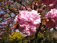 This Photo is of a Cherry Tree. I think Cherry Trees are really good for Photos as they are so beautiful and they blossom really well.
 I like this Photo because it is beauty in the middle of chaos. Again, the background is out of focus which gives it that extra edge.


Monday, 4 June 2012
Something Unique.
When I draw, I can never get both sides of the face to be the same. For example, one eye would be bigger/smaller than the other. To overcome this problem, I decided to draw about half of the face, maybe the nose, one eye and most of the mouth. So that is what I decided to do.
 I decided to do exactly that. I decided to make it a bit different though. I made it into a Rock chick sort of Person. I gave her a lip-piercing and a lip-ring. I also added high-lights in her hair.
Only after doing this I realised how much it looked like the Evil Queen from Once Upon a Time . Happy coincidence.


Only after doing this I realised how much it looked like the Evil Queen from Once Upon a Time . Happy coincidence.

Kenwood House.
Not to long ago, some friends and I went up to Kenwood House to see some paintings that we had done. It was a really nice day so we decided to explore the Grounds and take some photos. It was a really beautiful place and we all took loads of Photos.
 This Photo is really good for perspective as it is curving round the corner. It also really good for Light and Shadow as parts are well lit.
 I thought that this is just a really good Photo. It is half Tree and half Bridge so it divides the picture in half nicely. This kind of Photo is popular and very common. It is also easy to create.
 Again this Photo is a good example of a Dividing Photo as it is half House. Although it is different, as it has a foreground in front of it.
 This is a Moor-hen interspersed with leaves in Water. Again, this type of Photo is common as it focuses on one specific object surrounded by a repetitive background.
 I liked this Photo as it was a very oddly-shaped Tree. It was totally unique and I thought that no-one else would have this Photo.
 Again, this is a close-up of a Tree. It is nice as it is different colours which gives it Diversity.


Photography - Having a Change.
Some people say that Photography is not Art. I completely disagree. Photography is an Art in itself and I think it is really fun to do. There are loads of oppurtunities in everyday life that would make the perfect Photo. I have a few friends which are so good with a Camera. It is so easy to do as well. You don't evern need a digital Camera (although it would help, to upload the Pictures to the Internet) , you could do it with a Disposable One.
 I took this Photo in my Garden. It is of a Willow Tree. I like this Photo because it's not a perfect Photo. It captures the light well.
It is really useful to have a back Garden or a Park near-by as you can normally get some really good Photos there.
 This is another Tree in my Garden. This is a large Magnolia Tree and I like this Photo as it shows off the light and shadows really well.

It is really useful to have a back Garden or a Park near-by as you can normally get some really good Photos there.

Keep Calm Painted Canvas'
For a new Project, I decided to make a more popular painting. I realised that the Signs for Keep Calm and Carry On were everywhere and were being personalised such as:
 Keep Calm and Call Batman. I found a lot of similar Pictures, just by searching in Google Images.
I decided to do a few of my own, on Canvas Boards or mini Canvas'.
I am sorry about them being Side Ways though.
 This is my Titanic themed painting. I used Arcylic paints and it was on a Canvas Board.
 This was my Lord of The Rings themed painting. Again, I used Arcylic paints on a Canvas Board, but I already knew that this design had been done before.
 This was my first Design. I got the idea off a Cushion and I used Oil Paints. I managed to paint a rather wierd Crown on top of it though. I tried to made the top of all of my Paintings personalised.
 This was a random inspired one as I ran out of ideas. It was on a mini Canvas and I used Acrylic paints. I tried to make it colourful to reflect on the message of the Painting. Again, I thought up this slogan, but got the Idea off a make-up bad that said Keep Calm Your Gorgeous

I decided to do a few of my own, on Canvas Boards or mini Canvas'.
I am sorry about them being Side Ways though.


Sunday, 3 June 2012
Art Supplies.
As everybody knows, you need Art Supplies in order to do Art. But at times such as the TV show Friends, they managed to spend $ 300 (£200-250) on the Supplies. In fact, you don't need to spend that much at all. I didn't becuase I didn't want to. I wanted to find a bargain.
Firstly, I went to The Works. I managed to find some really awesome stuff there.
 These are 20 Acrylic Colours. They are 20 colours in 12ml tubes. Acrylic colours are really useful as you only need water in order to wash the brushes and change colours.
This box is available for £ 4.99.
 These are the Paint brushes that I bought there. I don't believe in spending a lot on Paint brushes because what is the point? This is a Value pack of Paint Brushes which are available for £ 1.99 only. I find these Paint brushes really useful because they come in so many different sizes and shapes.

This is a close-up to show you all the different types that you get in the pack.
 These are Oil Paints. Although these require Turpentine to wash the brushes, which is highly toxic, they are so much more Proffesional. I used these for my Animal Prints and some Projects at School. Unlike Acrylic, they take a lot longer to dry.
They are many more Canvas Boards and Canvas' that you can buy and that range from different prices. The general rule is that the larger the Canvas is, the more expensive it will be. I think that the most expensive Canvas in The Works is £ 14.99. It is huge though.
Firstly, I went to The Works. I managed to find some really awesome stuff there.

This box is available for £ 4.99.
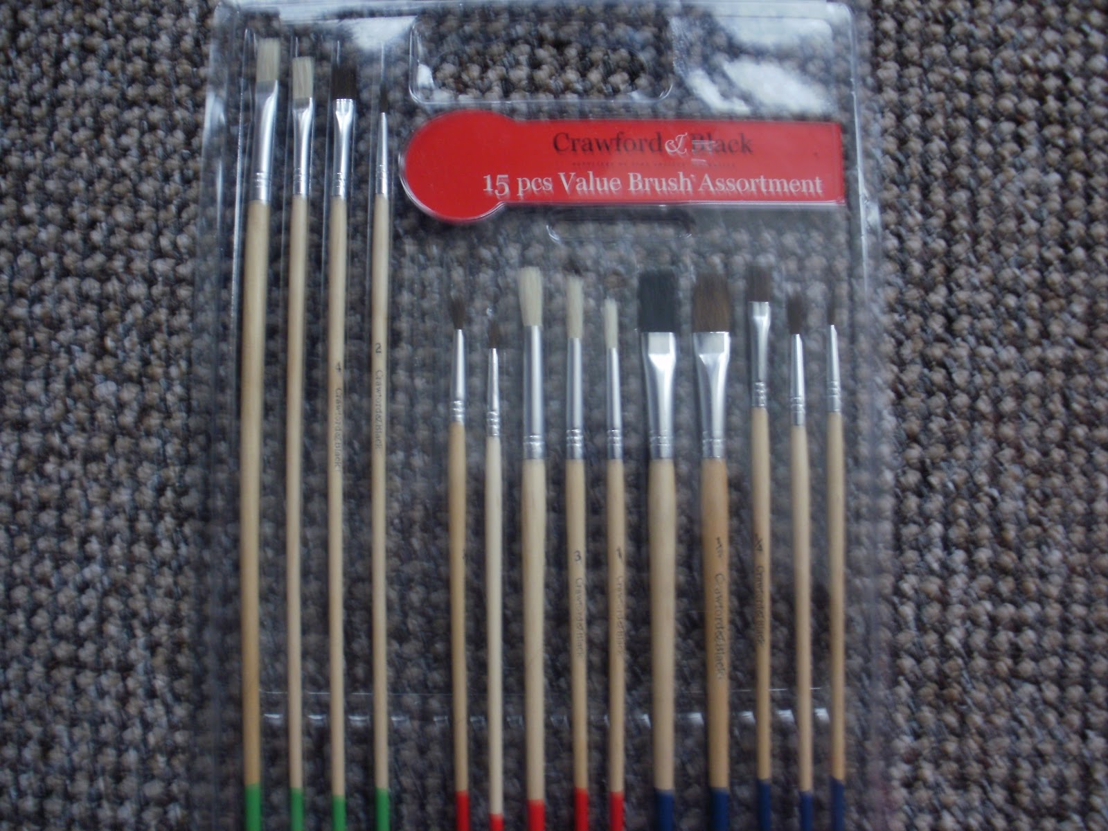

This is a close-up to show you all the different types that you get in the pack.

They are many more Canvas Boards and Canvas' that you can buy and that range from different prices. The general rule is that the larger the Canvas is, the more expensive it will be. I think that the most expensive Canvas in The Works is £ 14.99. It is huge though.
Adding a little Jazz...
At first, I made 2 Zebra Print Canvas'. However, I realised that I didn't want 2 of the same picture so I decided to change on a little. So I had a good idea.
 This is what I decided to do was to drizzle over it, different coloured Nail Varnish. This doesn't cost you anything as you prbably have some already and you don't need to use all of it.
This is the top-right corner of the Canvas. As you can see, I have got lots of different colours and made different patterns (sometimes drizzling and sometimes dotting) everywhere around the Canvas. This is to give a unique and individual look, as well as much more colourful to look at.


This is the top-right corner of the Canvas. As you can see, I have got lots of different colours and made different patterns (sometimes drizzling and sometimes dotting) everywhere around the Canvas. This is to give a unique and individual look, as well as much more colourful to look at.

Animal Prints.

This was the first painting that I did. I made it with Oil Paints on a Canvas Board. Both of these I bought in The Works.
Canvas Boards : £ 1.99 for 2
Oil Paints : £ 3.99 for 12 12ml tubes.
I bought the brushes from HobbyCraft for £ 3.49 for 4 brushes.#
I made 2 other Animal Prints like this. I made a Tiger and a Giraffe. Both of these I painted with the same supplies as the first Zebra Print.

This is the Tiger Print. I looked at a picture in my Animal Ecyclopedia and did it from that. Originally, the fur was menat to be pure orange but the black paint was still on the brush and it turned the orange paint slightly black.
This is the Giraffe Print. However, I think that this is the worst of my Prints as the spots are too small.

Hi!
Welcome to my new Gallery! I have made this blog, partly to show off my individuality, and partly because I wanted to show the World my art.
I am a firm believer in making Art, not War. But I am sure many will not agree. I wanted to show people that anything is regarded as Art and that you can do it without spending alot of money (which I found out).
So I hope you enjoy this and Thank You for reading this.
Subscribe to:
Comments (Atom)