People have probably wondered why I haven't done much lately. Although actually I recently completed my Project on my painting of Legolas from "The Lord of the Rings".
However, this year I went into Year 10 and am going to start my GCSE in Art. My teacher suggested that I do my Work on the topic of Characters. Most of all, I get to put my face into Characters which should be quite fun!
I have decided to put all my friends Faces' into the Knights of Camelot from the TV show "Merlin". I have yet to start this painting, but I will put up my Legolas painting and also a Gift Shop so you can buy your faourite paintings!
Sunday, 9 September 2012
Tuesday, 3 July 2012
Watercolour Twist.

This design is "I Jump, You Jump, Right?" from the film Titanic. I love Titanic so I decided to do this Canvas. I drew on the Watercolour pencil and then painted on Water to make the colour more prominant.

Monday, 2 July 2012
Eye of Sauron.
My favourite film is Lord of the Rings. I love it because it is filled with fantasy and imagination. It is really cool and I love the Story and the Colours. So, over a Week-end, I decided to paint the Eye of Sauron. I thought that this would be easier than any other Cahracter becuase it was just an Eye.
 In reality, I found it quite hard because what I didn't realise, is it is not just Red - but filled with different shades of Red, Yellow and Orange. I was also hard to create the Wispy effect. However, I carried on over the Weekend and I managed to get it finished.
I made this Painting on a Canvas that was much bigger than the others that I has done. This was to ensure that I could fit in all the detail.

I made this Painting on a Canvas that was much bigger than the others that I has done. This was to ensure that I could fit in all the detail.
Changing Colours.

I also decided to draw a bigger one as one of my Friends decided that she loved it so much.

This is a close up of one of the corners. This is to give you an idea about the layers of colour. I really enjoy using this tecnique. I find it an easy way to communicate the different colours in an object.
Just Dots.
Not too long ago, I was doing a Project in my Art Class. It was centered around Dots, mainly focusing on Damien Hirst, Yayoi Kusama and Traditional Aboriginal Art. It was a really fun Project and we had to design Canvas' with the subject of Dots. These were the ones that I made:
 I decided to do my first one in the shape of a Wave. I decided this becuase it is something that is free. Sometimes they are stronger than others and they are unpredictable. They can be high and the can be low and sometime a bit disruptive! I though that this summed me up quite well.
I painted this one with Oil Paints, using the same 3 colours but mixing them together to create new ones.
 This Painting is made with brighter colours and with Acrylic Paints. I drew the Dots, painted them and then filled in the background with black. It's alot more colourful than my first one and I wanted to try something a bit more adventurous.

I painted this one with Oil Paints, using the same 3 colours but mixing them together to create new ones.

Thursday, 7 June 2012
Garden Beauty.
I love Gardens. They are an amazing place to find great inspiration for Paintings and Photos. Even if they are unkept Gardens, they still have a certain Charm to the Photos. Sometimes they look really good with computer effects. Particularly black and white effects. Here are some Photos that I took from my Garden.
 I like this Photo because the Object is in focus and the background is not. I think this gives it a really good background effect.
 This Photo is an example of persepective but also background light. Again, the most of the Object is in focus, apart from part in the Distance.
 I like this Photo because it is actually of 3 trees which most people miss. There is one either side but also one in the background. This gives it nice Diversity.
 I like this Photo because of its colour. I caught it as the Sun was setting and the colour became more intensified. Also, I like the background of it even though it is not in focus.
 I like this Photo because it is Simple. It's not anything special and the colours are blocked and not to complex.
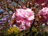 This Photo is of a Cherry Tree. I think Cherry Trees are really good for Photos as they are so beautiful and they blossom really well.
 I like this Photo because it is beauty in the middle of chaos. Again, the background is out of focus which gives it that extra edge.


Monday, 4 June 2012
Something Unique.
When I draw, I can never get both sides of the face to be the same. For example, one eye would be bigger/smaller than the other. To overcome this problem, I decided to draw about half of the face, maybe the nose, one eye and most of the mouth. So that is what I decided to do.
 I decided to do exactly that. I decided to make it a bit different though. I made it into a Rock chick sort of Person. I gave her a lip-piercing and a lip-ring. I also added high-lights in her hair.
Only after doing this I realised how much it looked like the Evil Queen from Once Upon a Time . Happy coincidence.


Only after doing this I realised how much it looked like the Evil Queen from Once Upon a Time . Happy coincidence.

Subscribe to:
Posts (Atom)